Role: Creative Director, Principal Designer
Contributors: Adam Draper (Director, Product Design), Stephen Liu (Sr. Product Designer), Rawan Kobeissi (Sr. Product Designer), Jared Adams (Graphic Designer)
People.ai is a sales productivity software company that provides an industry leading data platform that uses artificial intelligence to make sales teams highly effective. AI is used to automatically capture sales activities and provide highly accurate insights to sales leaders to better track/assess the state of deals.
Approach
Starting in Q2 of 2019, after raising a series-c round of funding, People.ai needed to breathe new life into their visual brand.
As a part of the marketing team, I conducted internal interviews with key stakeholders and worked closely with both marketing and product design to build a visual brand that would work in all facets of the organization.
Strategy
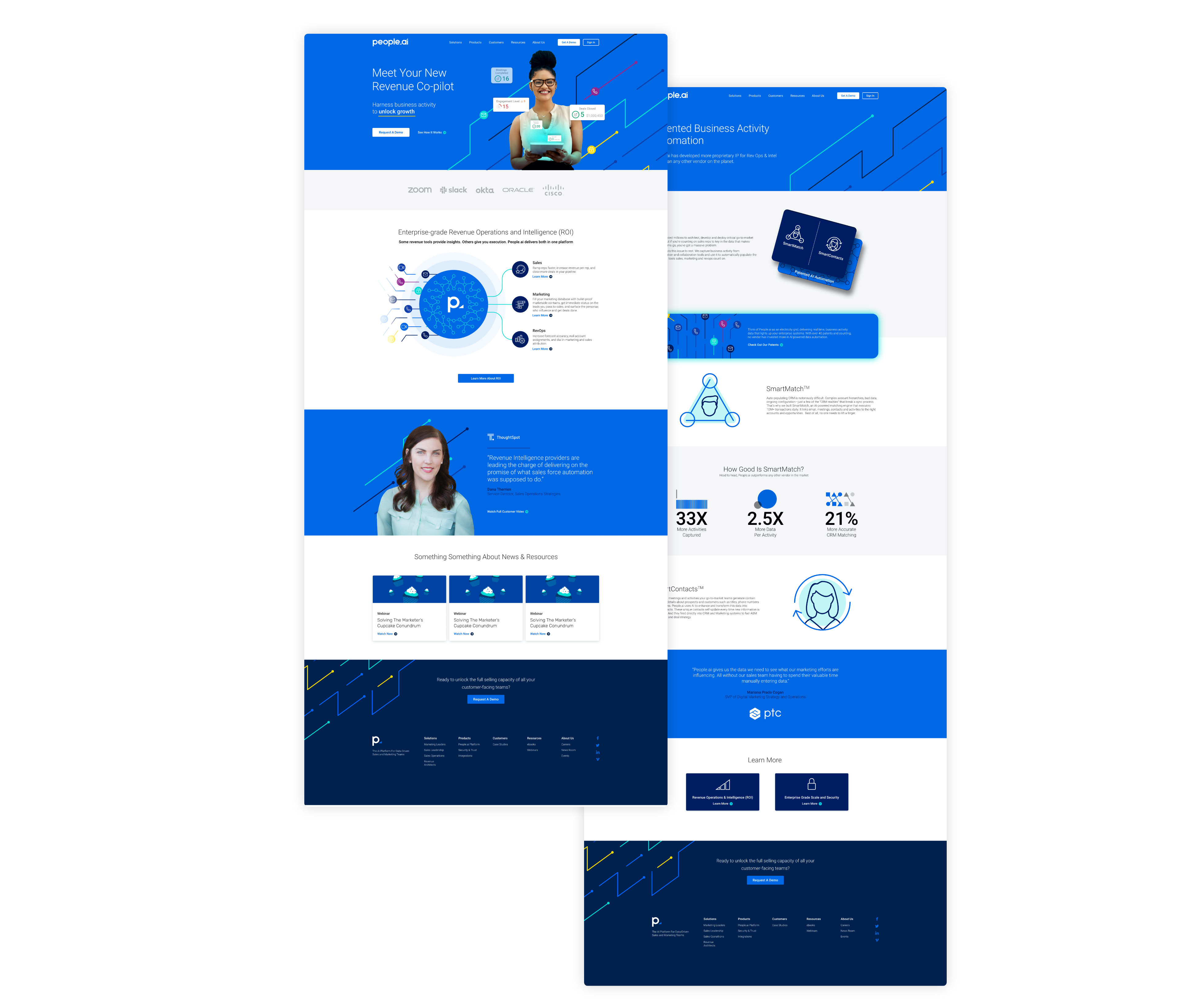
The existing visual brand felt like an out-of-the-box startup and failed to tell any relevant story.
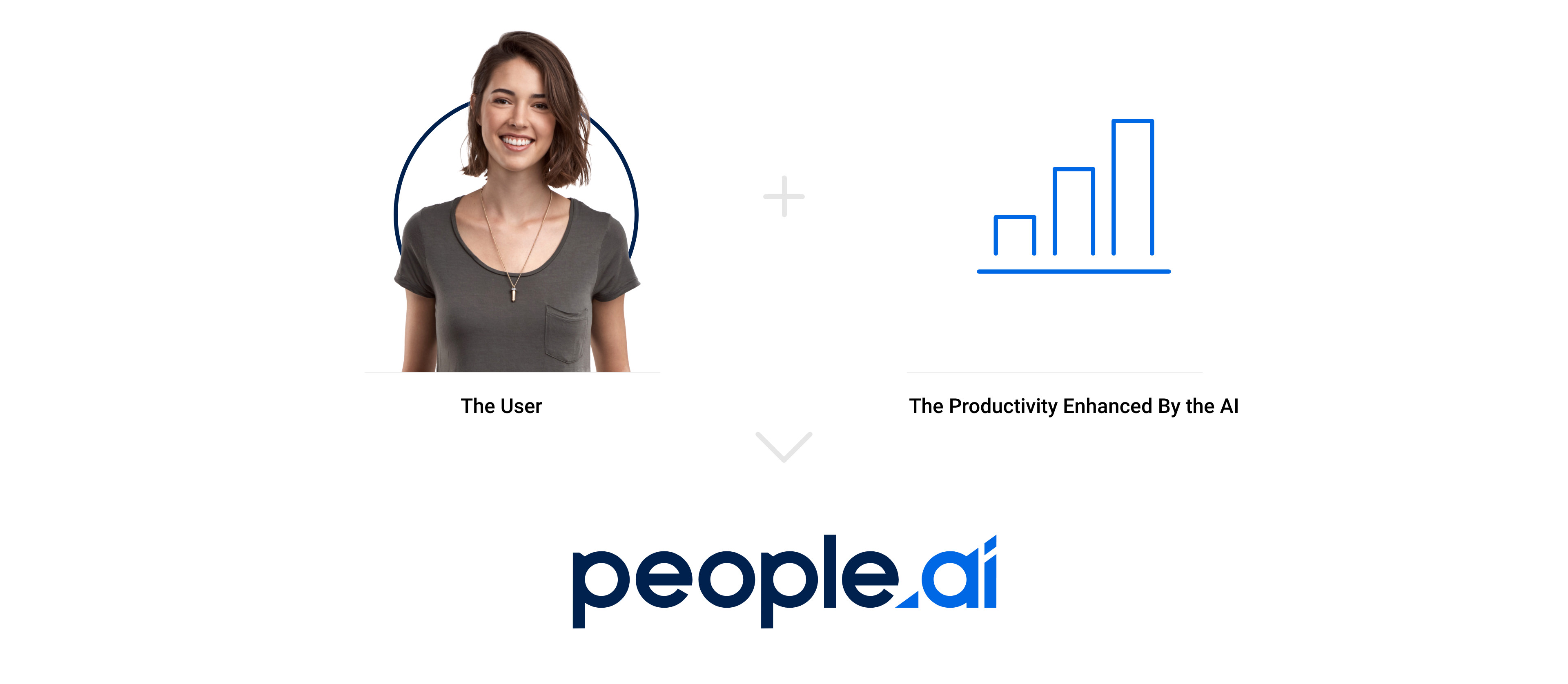
As interviews were conducted a consistent story would bubble up. That story was the impact that People.ai had on, not only the person, but the process. People.ai's patented data platform and artificial intelligence served as a productivity enhancer and made sales teams exponentially more productive and accurate. This story served as our north-star for the rebrand. Alongside of that north-star, we set out to build a visual identity that was clear, bold, and appealed to CROs and sales leaders in the larger enterprises People.ai was selling into.
Buildout
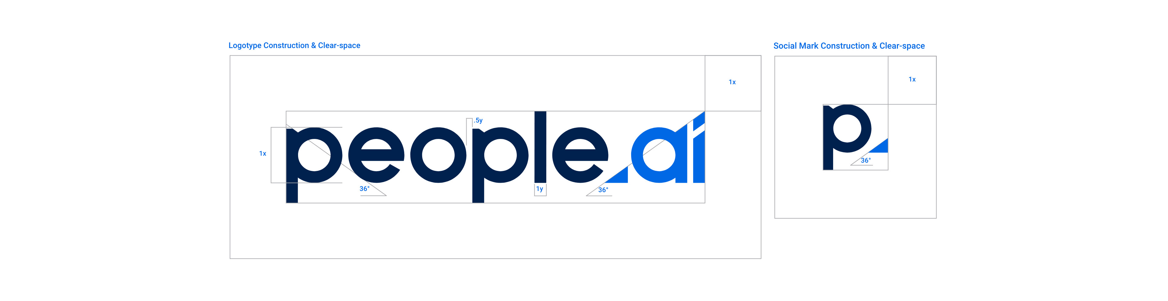
Once the logo was finalized, we then began finalizing the construction of the mark and build-out the rest of the visual system.
Color
Working directly with the product design team, we built a color palette that not only gave the brand a bolder presence, but also provided a AAA level of compliance to make sure that users with visual impairments would have no trouble using our product UI.
We also surveyed numerous individuals within the organization to assemble a set of color traits that would help us determine a specific color direction.
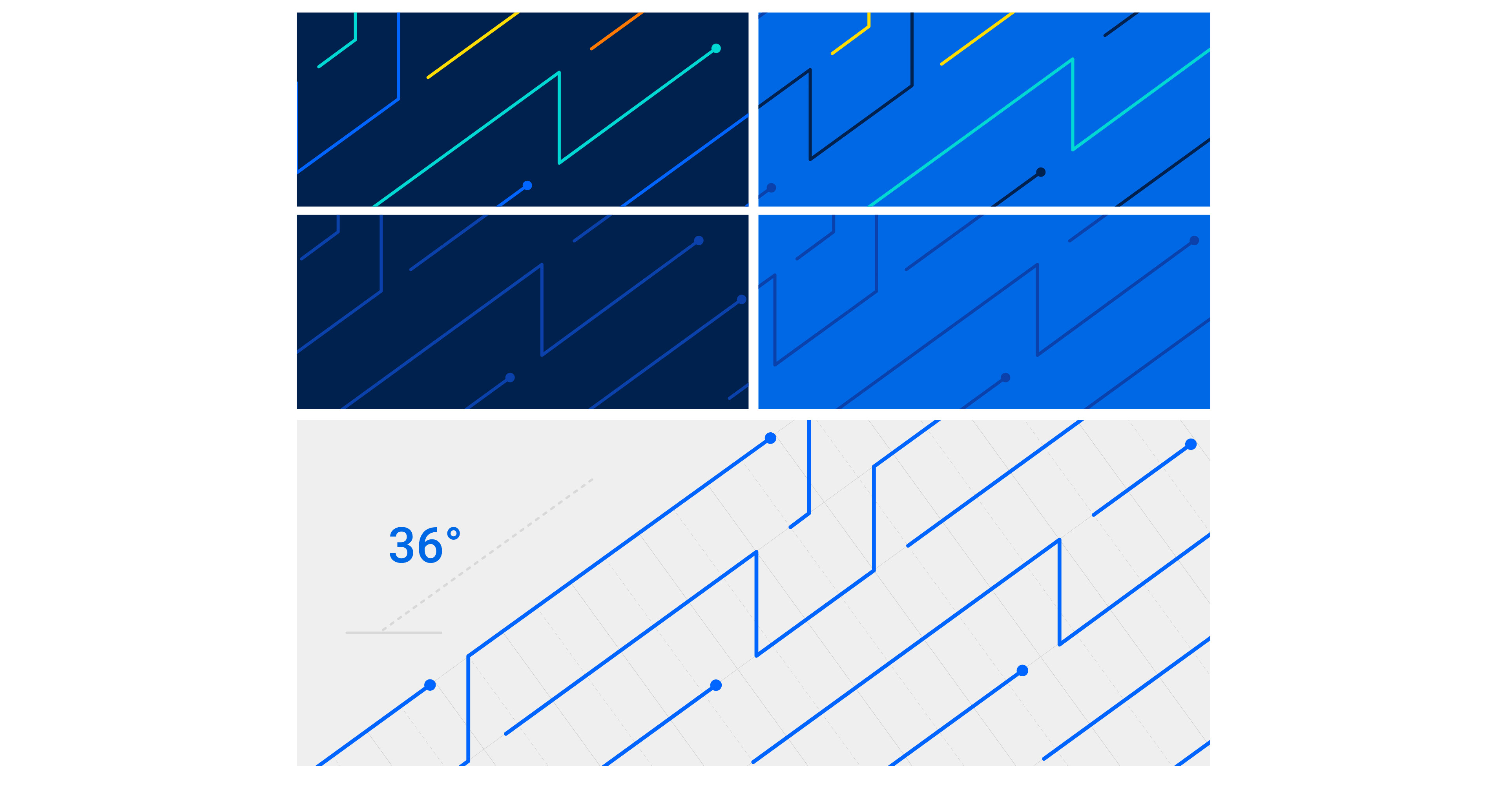
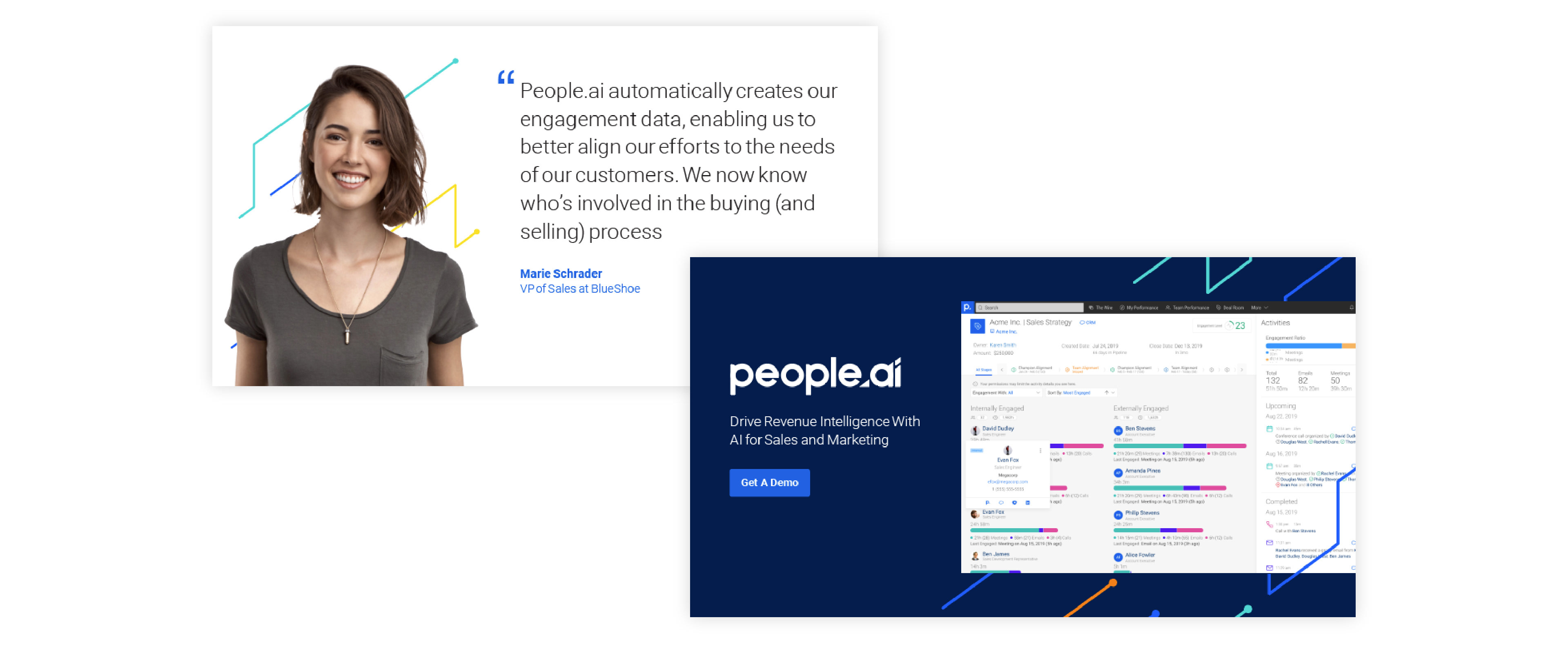
We settled on a vibrant blue as the primary color and paired that with two darker shades of blue and a teal accent. This primary palette allowed us to create high contrast brand elements and alternate between different background colors. Supporting the primary palette is a set of secondary colors that served as accents and gave us the ability to standout with a higher level of visual variation.

Type
From a typography perspective we settled on Roboto because of it's clear, straight-forward letterforms. Roboto's light weight added to this sense of clarity that we were looking to achieve and served as our primary type weight for all titles and body copy. We paired that with the medium weight for bold type, skipping the regular weight altogether.
Roboto is also part of the Google Fonts library, which made it incredibly easy to rollout to the entire organization.
Line Pattern
The primary visual expression of the brand consists of using flat areas of color or white while being paired with this line pattern in various ways. The pattern serves as a way to continue the story of AI as a productivity enhancer across all branded elements. Like the 36 degree angle created with the ramp in the ".ai" portion of the logo. The pattern follows that same angle.
Iconography & Illustration
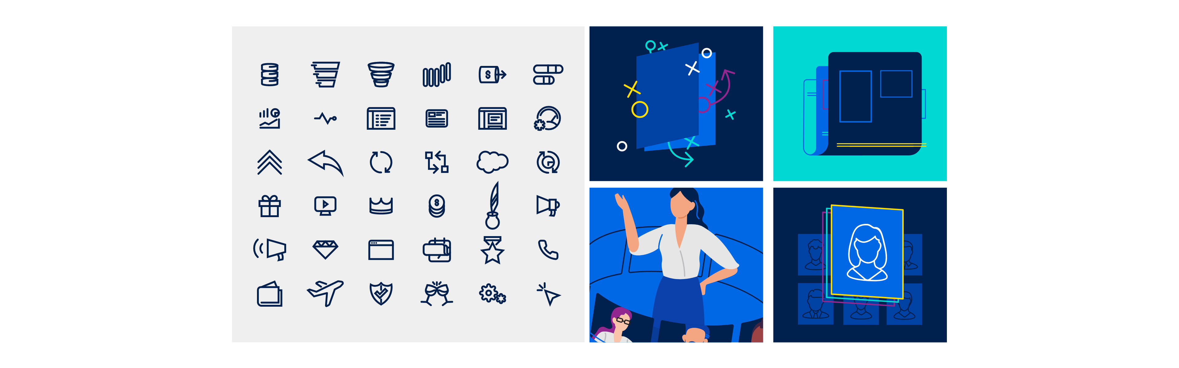
Keeping consistent with the rest of the visual language of the brand, we built a library of icons that were primarily line-based, but could also be paired with flat shapes of color. This was taken even further with our illustration and we set out to create a style that abstracted elements into simple, primitive shapes and accented by lines and our secondary palette.
Launch
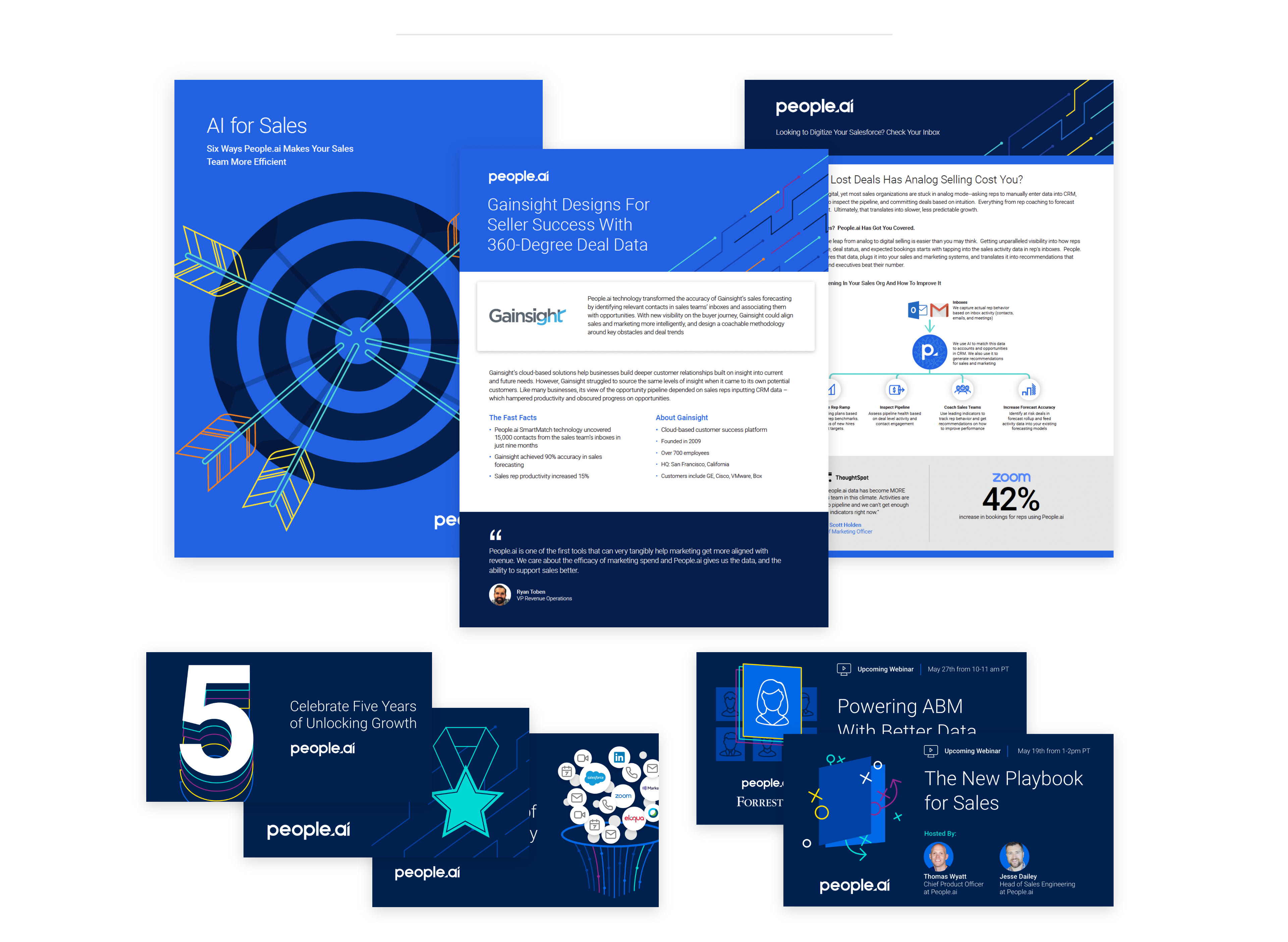
In September 2019 we launched our new visual brand to an internal audience and then unveiled the brand a week later to our external audiences through an updated website and complete conversion of social properties and collateral assets.