Role: Creative Director, Designer

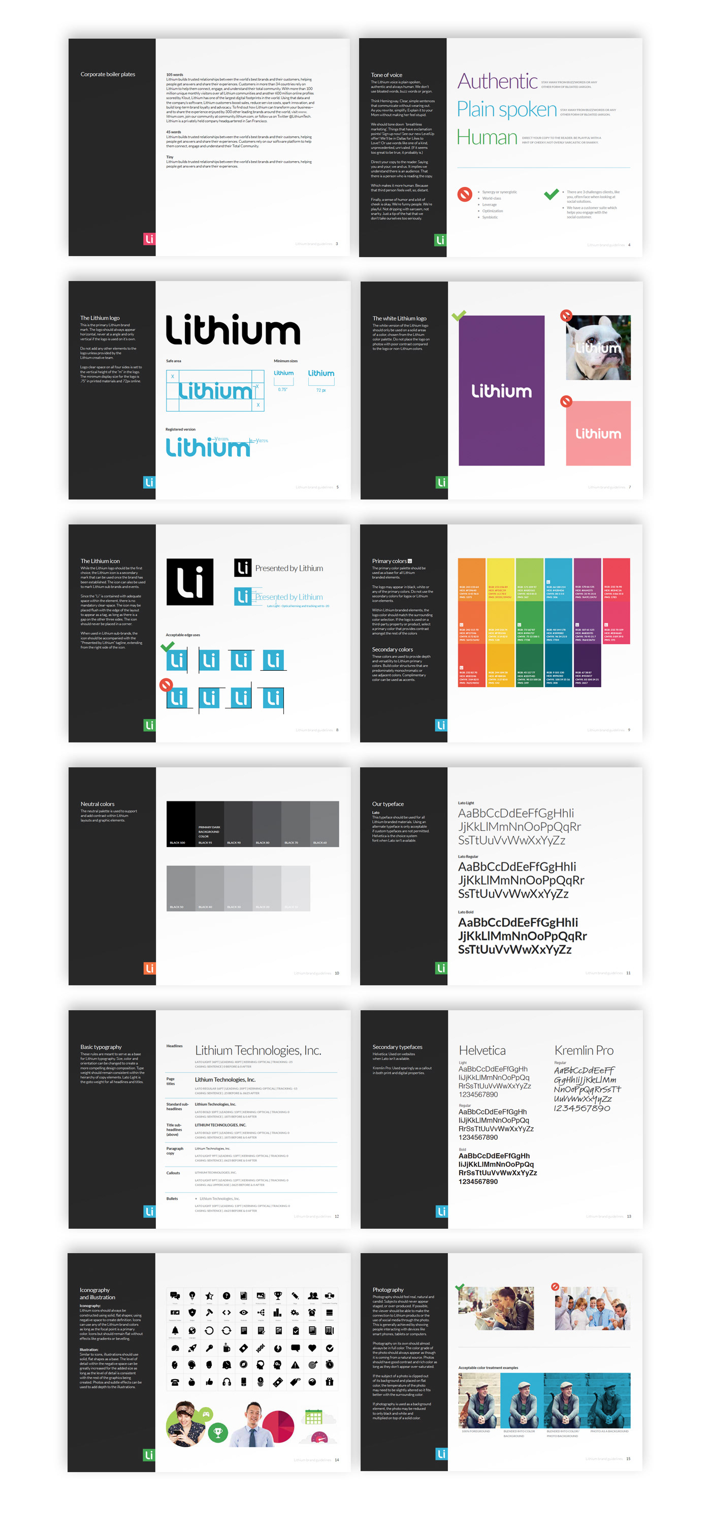
From the time of it’s initial rebranding in 2011, the Lithium brand has always been about range and flexibility. Lithium is a company that has always focused, primarily, on the success of it's customers and that variety of Lithium's customers have always been at the forefront of the brand. One of the key characteristics of the Lithium brand was it’s broad color palette. The palette consisted of highly saturated colors that, while bold and vibrant, rarely played together on their own and created limitations within the brand toolset.
After Lithium acquired Klout in 2015 the team decided to make a number of global revisions to the Lithium brand. The goal of the revision was to alter the tone of the Lithium brand from bold and vibrant to bright and human with a greater sense of maturity.
Color wasn’t the only aspect of the brand we set out to revise. The team also looked at everything from typography, photography and iconography and made numerous adjustments. First we changed typefaces from Din Round to Lato. Adopting the brand font directly from Klout. This helped to reduce the childish and overly playful look of DIN Round when paired with Lithium’s color palette. Second we slightly desaturated the color palette to retain the bright qualities of the brand without overpowering the viewer. That change to the color palette open the door for us to incorporate color photography into the brand. This was a simple touch that the brand needed at this stage and allowed us greater flexibility within the brand tool set.